CASE STUDY
Minecraft.net
Updating the gateway to the whimsical world of Minecraft


Unearthing the soul of Minecraft, inviting players to Dig Deeper.
Role
At the time of this work, I was the UX Design Director working directly for Mojang Studios, providing Creative Direction and Product Design
Delivery
Redesign, Design System
Updated UX and visual design across all pages
New look & feel, Updated purchase flow, Layered Vanilla hero image with day/night settings and animated mobs


The Quest We Took On
We were asked to give Minecraft.net a full glow-up: reimagining the UX to spark curiosity, simplify discovery, and deepen emotional connection with players old and new. From surfacing upcoming games and media to spotlighting the soul of Vanilla Minecraft, every decision balanced whimsy with intent.


RESEARCH INSIGHT
At the heart of Minecraft is a random seed engine—an algorithm that spins up endless worlds from a single number. This unpredictability fuels creativity and wonder, making every session feel brand new. We mirrored this spirit on the web with a dynamic, layered image system, allowing us to easily swap in biomes, times of day, and mobs.
Mob love runs deep

Our heatmaps told a clear story: players couldn’t resist the familiar faces of Minecraft’s mobs. The chicken and pig drew the most attention — reminding us that a touch of personality goes a long way in driving user behavior.
Minecraft UI is iconic and we wanted to bring coherence across the ecosystem

Unified Craft
What we did
We developed a cross-platform design system rooted in the language of Minecraft—drawing visual cues from the in-game Ore UI to create something both familiar and flexible.
How we won
Built to scale across core titles, new games, and Minecraft Education, the system balanced pixel-perfect charm with functional clarity, ensuring consistency without losing the playful essence that defines the brand.
Scalable block by block
Web system buttons blend Minecraft’s Ore UI with a streamlined, Mojang-inspired web aesthetic—bringing game-born charm into the web space. This hybrid design creates a consistent, scalable system that works across Vanilla, Dungeons, Legends, and Education, all while staying true to the brand’s playful pixel spirit.
From Vanilla to Minecraft: Education to the Help Center, the design system scaled like a well-placed redstone circuit across every game and service, all powered by the same visual and interaction logic. Every module and layout worked together to create an experience that felt familiar, intuitive, and unmistakably Minecraft.
The result?
A cohesive ecosystem that simplified development, accelerated delivery, and made it easier for players to dive into the world they love faster and with enchanted joy.
MOBILE EXAMPLES
With a growing share of visitors on mobile devices, every screen was crafted to scale meaningfully across touchpoints: ensuring discovery, storytelling, and purchase flows worked beautifully on the go, making it as easy to navigate as punching your first tree.
Vanilla Marketing Page
Dungeons Marketing Page
Account Management

Feature Highlights
-
![]()
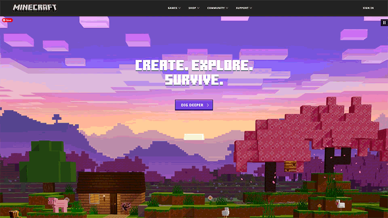
Multi-layered Hero Image
Echoing Minecraft’s random seed generation, our hero image uses a layered system to bring a sense of discovery and depth to the Vanilla page, with day and night variations complete with appropriate mobs, which signifcantly increased scroll depth.
-
![]()
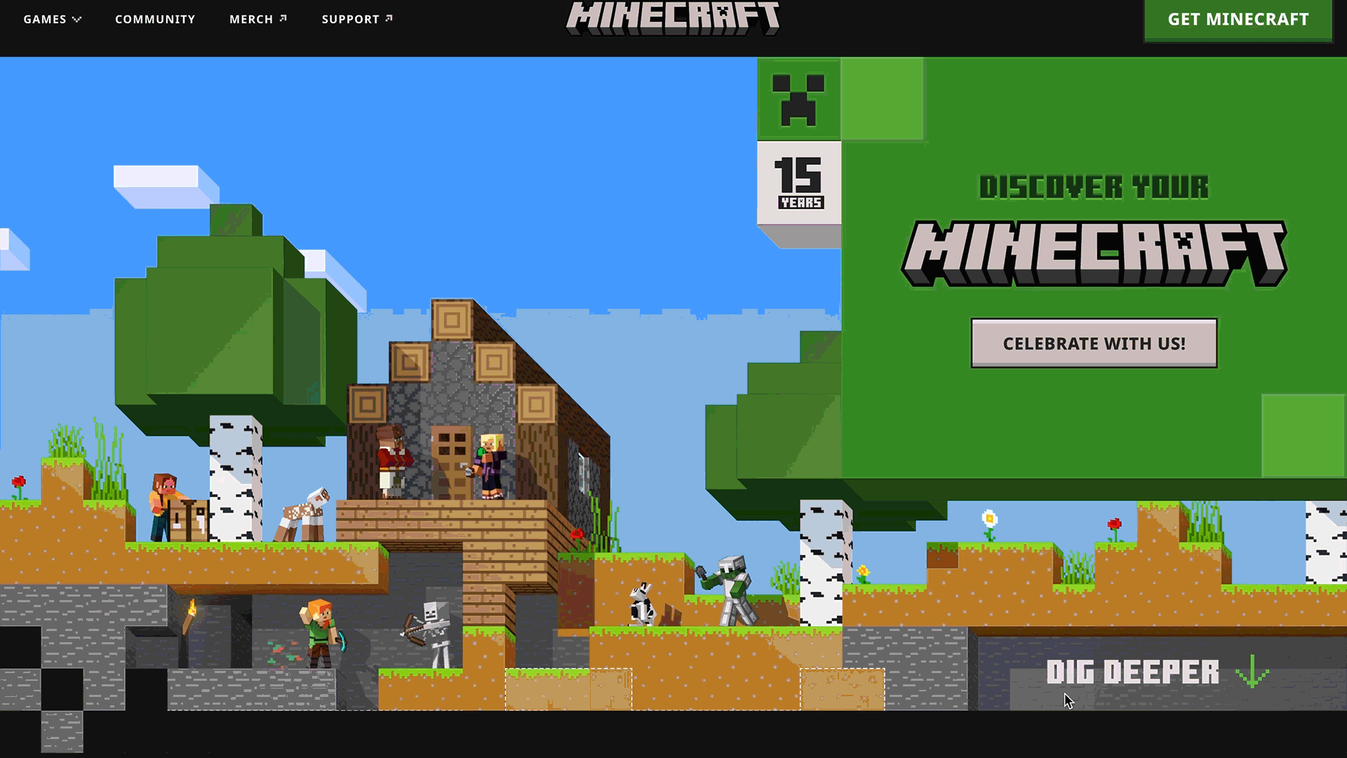
Interactive Giveaways
To celebrate Minecraft’s 15th Anniversary, we released a new web capability where players could mine blocks to discover a coveted in-game cape, one of the rarest items in the Minecraft universe, rewarding curiosity with something truly special.
-
![]()
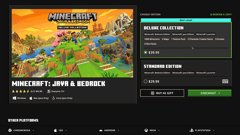
Improved Purchase Flow
A streamlined design system and clearer UX flow, including side-by-side game comparison charts, made it easier for visitors to understand their options and take action. The result: a smoother, more confident path to purchase across all titles.
-
![]()
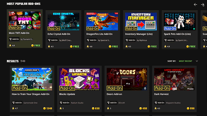
Marketplace Integration
We brought the Marketplace fully into the Web experience making it easier for players to search, explore, and purchase content directly from the web. The new UI surfaces items with clarity and visual polish, creating a seamless bridge between discovery and action.
The redesigned experience not only brought the Minecraft visual charm, the improved scroll depth directly increased traffic to the product pages and nudged conversion upward, proving that when you tap into the soul of a whimsical brand, players dig deeper.

Increase in Scroll Completion
(increase from 4% to 15%)
